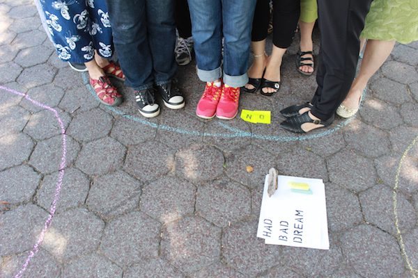
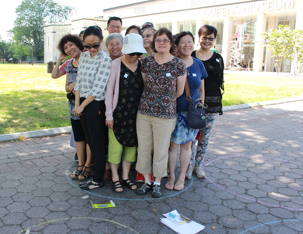
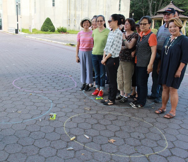
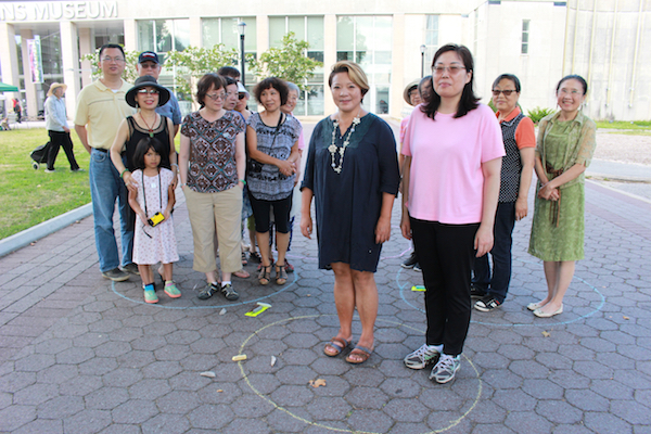
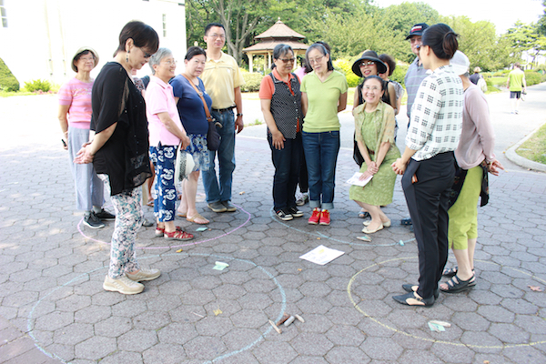
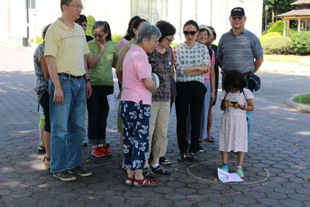
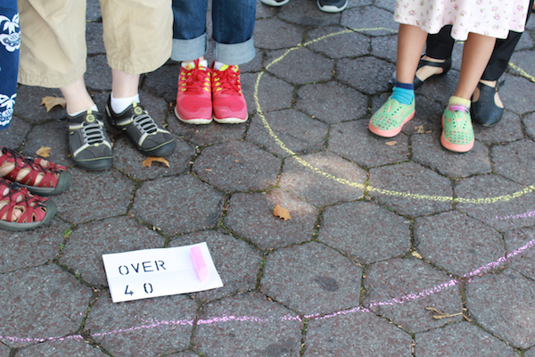
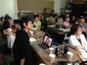
We started off the class with a group exercise in the park this morning, It’s an activity that I borrowed from
Jose Duarte‘s data viz workshops. I asked the students to draw a a few large circles (ie, bubbles) with chalks on the ground and we used them as bubble charts. From this exercise, I began to understand a little bit more about my students. For examples: 95% of students who came to my workshop on Sunday were born outside of US ; 91% of students in my workshop were female ; 86% of the students were above 40 years old of age; 100% of the students were smiling during the exercise ; none of the students were vegetarians ; none of the students woke up with nightmares or bad dreams the night before ….
I also asked about their morning routines : tea or coffee drinker? How they rated their sleep last night? Did they have a good quality of sleep?
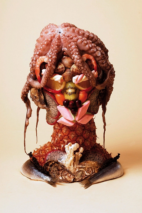
I had one student who raised the hand and said she did not understand the relationship between jumping between the chalk bubbles on the ground and data representation, right after I showed several beautifully choreographed infographics made with vegetable, match sticks, balloons, insects, and bread from Sarah Illenberger‘s work, such as the ones on this article.
I think we need more group exercises.
Today I also gave my students the most difficult homework of this workshop( and it’s only week 2!)
For the next two weeks , the students were asked to put together their first tool kit for visualizing their self-tracking data. I’ve decided to call it the Quantified Selfie Tool Kit. It will contain any tool and materials of their choice that will be helpful to bring their data into life.
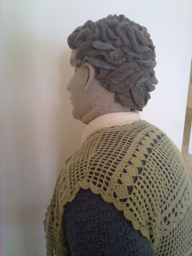
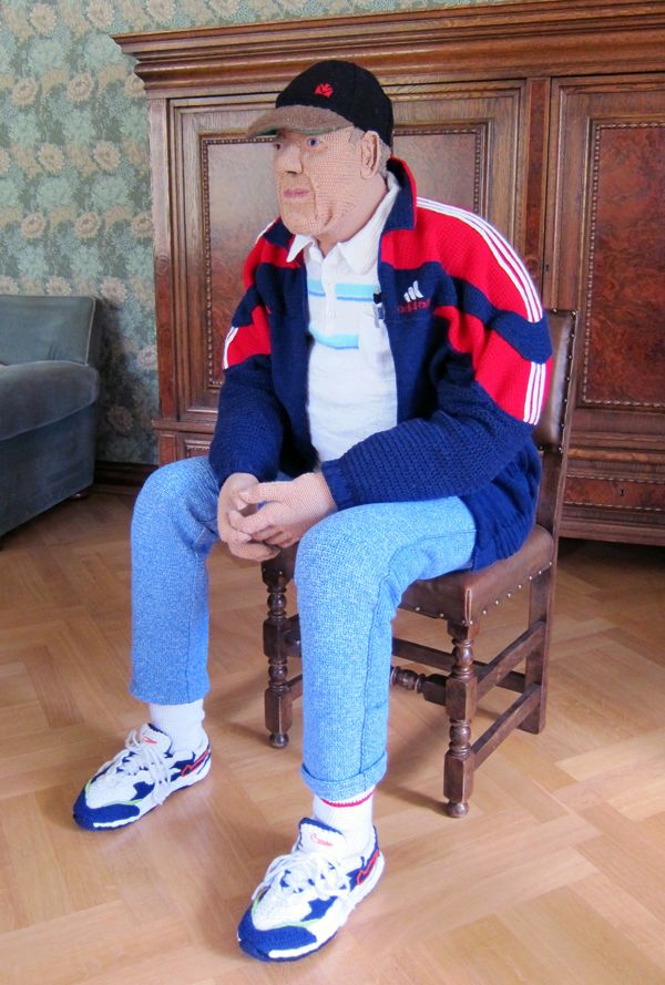
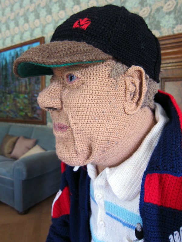
For this workshop, I can see a combination of data and crochet, projects in between the the experiments of
Natalie Rachel’s data scarves, and crochet sculptures from artist Liisa Hietanen, and
this interesting Pinterest with a collection of crochet sculptures could also provide interesting direction.
Artist Lauren McCarthy spend her afternoon with us and tell us about her projects made for her social life (or lack of) and social-awkwardness and people alike.
Class 2 | 8 /2 11am -1pm @Queens Museum
- Data Visualization in the Park
- Guest speaker Lauren McCarthy http://lauren-mccarthy.com/
- Homework: Quantified Selfie Tool Kit
* Create your own measuring device / reporter that report its measurement. Continue to track your activities and record your data.
* This week, discover tools that can help you visualize your data in physical world. Collect your tools that you think may help you build your self-portraits.
For example, they can be daily objects that you are interested in , they can be tools that you are comfortable with, they can be pen and pencils, paper, sticky notes, balloons, yarns, recycled materials. They can be modeling clay, cotton candy, pingpong balls.
Don’t forget: * Your job is to measure something interesting, and/or measure something in an interesting way, and/or create a interesting provocation by bringing an uncommon measurement to our attention.
Questions:
How easy is it to enter your data?
How does our quantified-self represent us?
What objects can we use to represent data?
How does data tell a story?
What is the poetry of data visualization?
Class Link
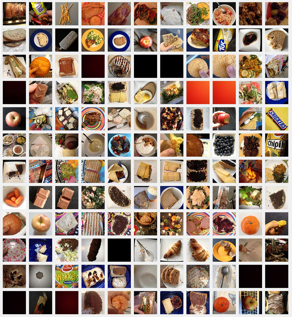
For students who are interested in Food, Diet Tracking and Weight Loss, I suggest starting by writing down the type of food, time for every meal, food category, also track other variables such as mood, hunger, times of the day when the meals are eaten, numbers of daily meals, how fast or how much we eat (
how many bites)
I think the most helpful tools can be as simple as an Excel Sheets (so you can export your data later more easily) and a Camera —
Taking photos of every meal
image curtesy and artist: please refer to links inside this blog post
For the crafty ones, I thought projects using data and crochet, knitting could be very interesting:


image curtesy and artist: please refer to links inside this blog post
Artist Natalie Miebacj build beautiful sculptures using DIT low tech data collectors


 New New Yorkers